
The Evolution of Snickers Packaging
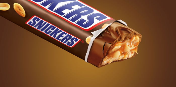
Riverside, CA. There’s something functional & nostalgic about how recognizable a Snickers actually wrapper is.
You could see the tiniest torn piece of brown wrapper with a little blue and red showing, and most people would immediately know it’s Snickers. That’s how deeply ingrained the branding has become in American culture.
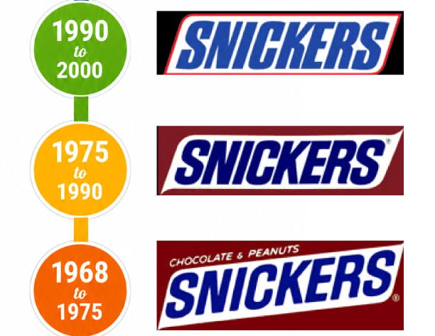
That’s what makes the evolution of the Snickers brand so interesting. Over the decades, the logo and packaging evolved, but the identity never really changed. The company understood the importance of consistency long before most brands did.
The early packaging from the 1930s had a much more vintage Americana feel, with illustrated graphics and old-school typography. But by the late 60s, Snickers found the visual formula that would define the brand for generations:
the brown wrapper, bold blue lettering, white center, and red outline.
Those colors became iconic.
What’s impressive is that Snickers never overcomplicated the branding. Even as the logo became cleaner and more modern through the 80s, 90s, and 2000s, it still looked unmistakably like Snickers. A lot of brands lose themselves chasing trends. Snickers stayed familiar.
And that familiarity became emotional.
For a lot of people, the wrapper is connected to memories — Halloween nights, road trips, movie theaters, gas stations, trading candy with friends, or grabbing a candy bar after school. The packaging became more than advertising. It became part of people’s lives.
That’s why the branding feels historic across generations. Grandparents recognize it. Parents recognize it. Kids recognize it.
Only a collective of long standing brands can say that.
Snickers managed to create something timeless: a wrapper so recognizable that people don’t even need to read the logo anymore. The colors, shapes, and overall design already tell the story instantly. In fact the logo can say something completely out of the ordinary, and it will still be recognizable as proven in a previous campaign run.
Blog / The Evolution of Snickers Packaging
by @evanipo
Creative Experiment
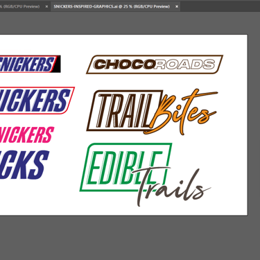
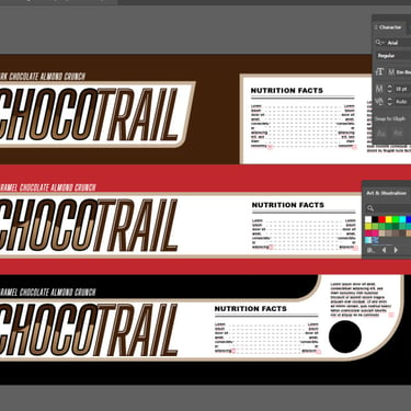
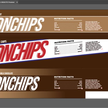
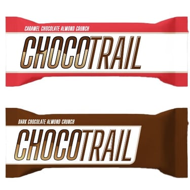
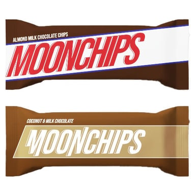
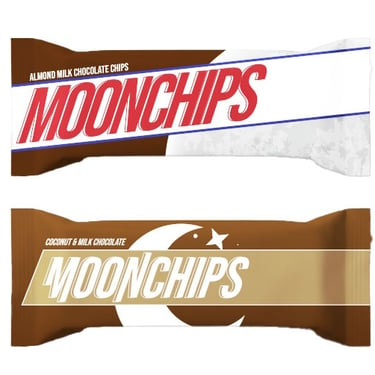
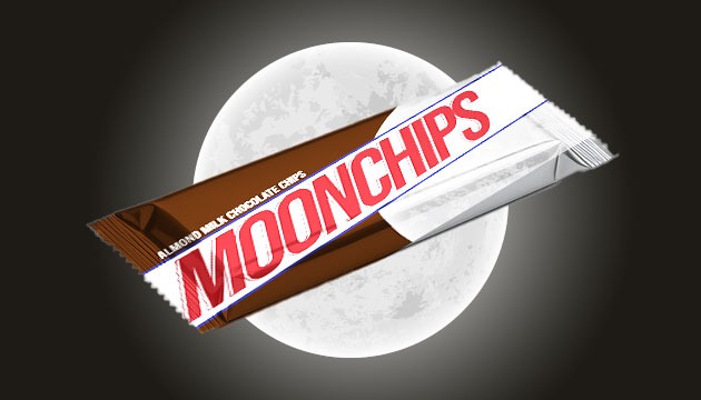
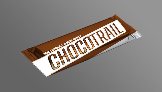
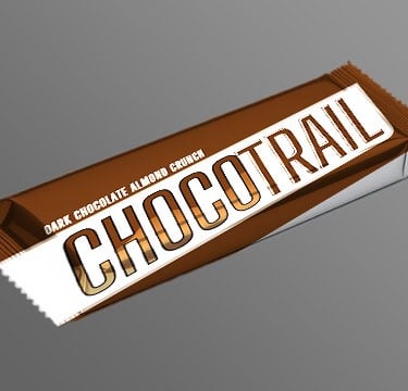
Often times drawing inspiration from another brand requires a deep dive into the nature of the actual logo itself. It is better to keep things simple, and let the product speak for itself. The logo than becomes a reminder of that cool experience, or sugary bundle of goodness! Below are screenshots and a creative process of 2 mock-up brands.
Growing up in the 80s and 90s, Snickers was everywhere — especially during holidays. Much like most American branded treats, they all played a roll in traditions, upbringings, and the way we saw and treated these packaged goodies. The candy wrapper became a staple for a sugary pleasant, dopamine hit.
Evan's Creative Studio
Copyright 2026 ® evanipo.com All Rights Reserved
Privacy Policy + Terms & Conditions
+ Store Policy + Media